It’s all about balance
With any customer communication, teams need to strike a balance between being helpful and informative and not distracting from users’ experience in the product. Pendo makes finding that balance easier.
When Design Pickle launched a new product or feature in the past, they often relied on what was essentially cold outreach via email. “We know you’re a customer, we know you’re engaged, but some of those users might not have any context around or use for the new feature we’re releasing,” Adams Dodd, senior product marketing manager, explained.
Once they brought Pendo into the mix, Dodd and the rest of the team started to rethink their announcement strategy. “We really focused our efforts around creating meaningful announcements that get people to do things in our platform and engage with our website without completely distracting them from the experience.” Design Pickle turned to Pendo to bring these communications in-app, allowing them to better balance how often (and when) users see announcements and ensure messages are relevant to the intended audience.
A new kind of product launch
For the launch of its motion graphics product—the company’s first ever video product—Design Pickle knew it needed a seamless in-app strategy to help drive adoption of this exciting new offering that many customers had been asking for.
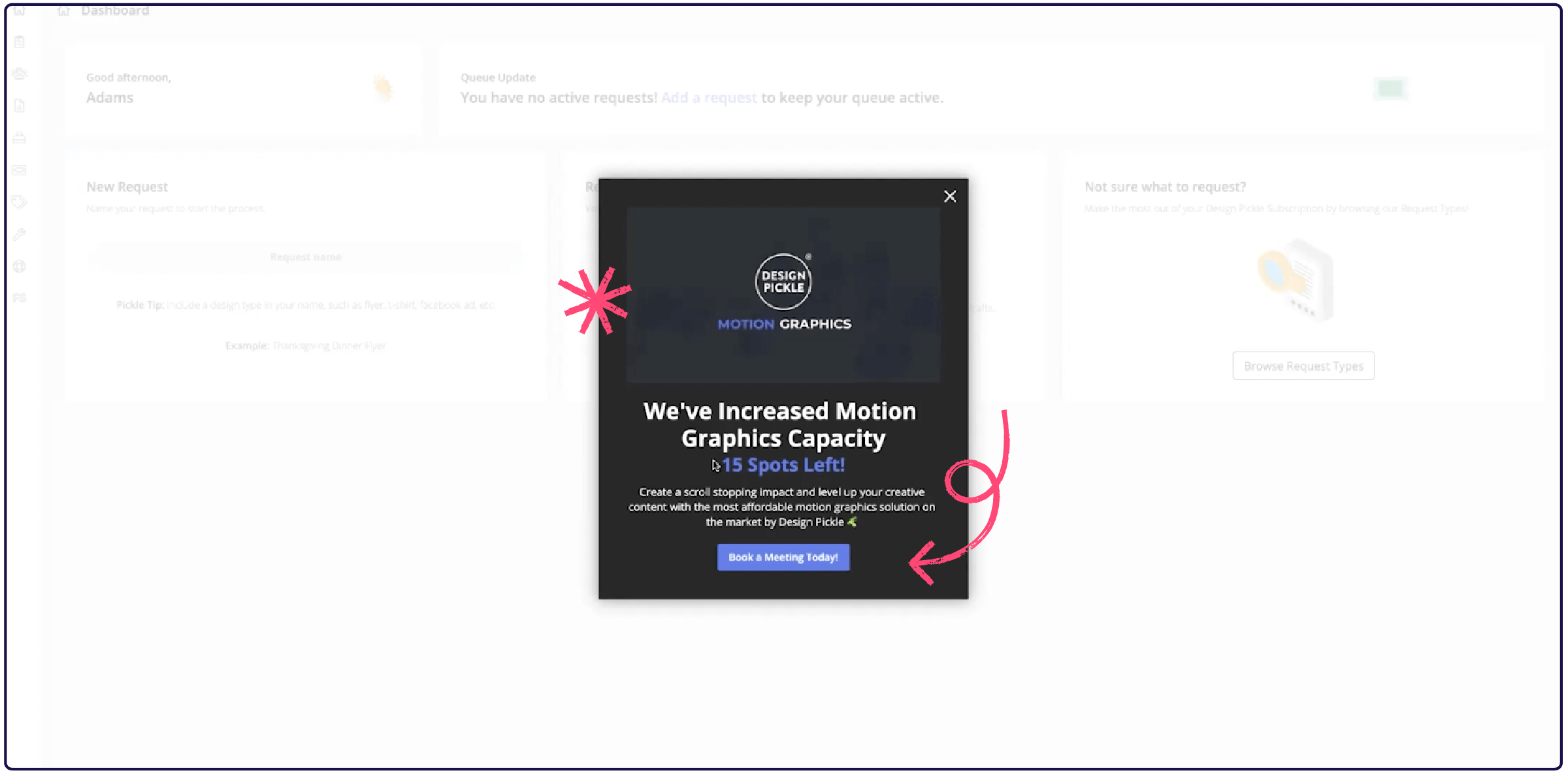
After creating several smaller in-app announcements to garner interest and collect feedback to shape the functionality of the new product itself, the team was ready to kick launch efforts into high gear. Dodd built an in-app guide to announce the new product and encourage existing customers to add it to their subscription. “The goal was to drive people who were already engaged to schedule an appointment to talk to an account manager about switching to motion graphics or adding it to their subscription stack,” he explained.
Since the announcement would appear when users logged into the platform, one of the team’s main priorities was determining how to layer in meaningful information without making the guide too long. They decided to include a short product overview video and, more importantly, the number of meeting spots that were still available. “We wanted to base it off of airlines that tell you how many seats are left on a flight when you’re in the process of booking, Dodd noted. “Someone sees that and they say to themself, ‘I have to do this now or I’m going to miss my chance.’”

This in-app announcement strategy proved very effective for Design Pickle. “We have clients who had gotten email campaigns from us and seen announcements on the website [and didn’t take any action], but once they got something like this in-platform, it got them to convert,” Dodd shared. On the day of the motion graphics launch, the in-app guide drove nearly 30% of new subscriptions—customers either booked a meeting directly through the guide or saw the announcement and proceeded to contact their account rep directly.
Since the announcement guide’s creation, Design Pickle has seen a 3-5% click through rate to book a meeting. They also use HubSpot to track how the meeting has turned into a potential sale or upsell. And the work hasn’t stopped there. If he sees that someone clicked on the CTA but didn’t schedule a meeting, Dodd often re-sends the user a message with an account manager attached so that they feel like they’re getting a custom experience around potentially upgrading to the motion graphics offering.


