What comes to mind when you think of the construction industry? Probably not software–but it should.
Construction businesses have started to introduce (and rely on) technology to improve their processes, production, and employee experience. And software companies have emerged with the sole purpose of supporting the construction industry, one of those companies being Procore.
Since Procore’s platform is meant to bring together all project stakeholders and improve communication and efficiency, they have a lot of different types of users. From jobsite workers to office administrators, Procore’s software experience needs to be hyper-personalized, yet still cohesive. Pendo in-app guides have been crucial in making that happen.
Here are four lessons from Procore’s guide strategy:
1. Personalize communication based on users’ roles
Since they serve such a unique mix of users, the Procore product and UX team needed to develop a nuanced understanding of their audience. What does each type of user actually need from the platform?
Jobsite workers, for example, use Procore in fast-paced and loud settings, where in-app communication can be distracting (and even harmful). Users who work in offices, on the other hand, often need a lot of detailed information about a particular topic, making things like in-app walkthroughs extremely effective. With Pendo, Procore is able to serve both types of users (and more) with information that caters to their specific needs.
The takeaway: Spend time mapping out your product’s different users. How do their day-to-day responsibilities, surrounding environment, and overall goals impact the way they’ll use your product? From there, create segments so you can target in-app messages and resources to the right users at the right times.
2. Customize in-app guides to meet your users’ needs
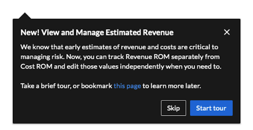
Building off of segmentation, put yourself in your users’ shoes to determine how in-app guides should look, and what content (and CTA) they should include. One way Procore customized their guides was to offer admins the option to tour a new feature as they’re working in it.

What’s more, they also included a link to where users can learn more about the new feature (encouraging them to bookmark the page) as well as the option to skip the tour. These seemingly small decisions go a long way in making users feel informed, but not bombarded with too much information.
The takeaway: Think about how your users (and specific segments) prefer to receive information. Consider how much text to put on the guide, where it makes sense to include a “skip” option, and which additional resources to include. It’s also important to choose the right guide type–for example, tooltips and lightboxes each work best for different purposes, and should be used accordingly.
3. Think of guides as part of your product
When it comes to in-app guides, it’s important to think of them as an extension of your product itself–not just something you overlay on your UI. The Procore team realized this early on after seeing success with Pendo guides and identifying these guides as a key part of their product experience.
The guides you create should look and feel like they’re part of your product. In fact, users should never actually sense that an in-app guide wasn’t built by your engineering team like the rest of your application. Make sure you’re utilizing any preexisting brand guidelines as you build your guides so that users will immediately associate them with your company and product, making them more likely to pay attention to them in the first place.
The takeaway: Your in-app guides are an extension of your product, and should be treated as such from a visual standpoint. Always create guides that are on-brand (including in design and voice/tone) so that they enhance, not distract from, the product experience.
4. Create cross-functional best practices around guides
As Procore’s product and UX team started seeing early success with their in-app guides, other groups across the organization started utilizing guides in their own efforts, too. At one point, there were over 100 people across dozens of Procore teams using Pendo. To ensure there was still a consistent customer experience and their guides felt cohesive, the team created a Pendo Center of Excellence. The goal? To help standardize best practices around in-app communications, and avoid guide sprawl.
Especially if teams in your company want to leverage the power of in-app guides, it’s important to have some processes and standards in place. Decide who owns writing the copy, who should approve segmentation, and even who will play the role of air traffic control to make sure guides aren’t overlapping and competing with one another.
The takeaway: Create clear processes around guide creation and execution. It’s also useful to create a cross-departmental tiger team to own your in-app guide strategy (at Procore they call it their Pendo “strike team”), with representatives from product, design, product marketing, and product ops.


