Adoption

The lifecycle of in-app guides: How to optimize your guides in 3 phases

Published Aug 24, 2021

If you’ve taken part in team-building exercises, you’re probably familiar with the trust walk. Colleagues pair up, and one serves as the navigator while the other is blindfolded. The navigator uses verbal instructions to lead their partner through a series of obstacles, illuminating the importance of communication, responsibility, and trust. 

Outside of the corporate world, there is a lot to be learned from this activity–in fact, guiding users through your product parallels this relationship. As a product leader, you know your product’s ins and outs while your partner–the user–is not as familiar with it. Users have to rely on your communication, through in-app guides, to lead them in the right direction. 

But as we all know, trust is built over time. Rather than treating your in-app guides as singular projects, think of them as an ongoing, cohesive effort. Taken together, these communications allow you to guide users to success in your product, all the while building trust and driving long-term engagement. Here’s how to think about the lifecycle of your in-app guides in three key phases:

Phase 1: Align guides with your goals and target audience

The first thing to consider, naturally, is the purpose of your in-app guide. If your intention isn’t clearly defined, you may be in the midst of reviewing guide metrics, only to realize that you have no idea whether you successfully reached your goals. 

If your goal is to help users adopt key features, you will first have to determine which features are being overlooked in order to show users the value that they’re missing. If your team is facing overwhelming support call volume, understanding where users are getting stuck will enable proactive assistance. Or if you’re introducing new features, your objective will be to highlight them in a way that urges immediate engagement. Distinguishing current user behavior and ideal user behavior will make bridging that gap much more manageable.

On the other hand, the only thing worse than a lack of instruction is the opposite: being bombarded with too many guides as you’re trying to use an application. Guides are effective when they reach the right people; otherwise, they’re a nuisance. Once you’ve determined the guide’s goal, being deliberate in how you target specific user segments is critical to success.

How technically proficient is your target user? Too much jargon can be overwhelming and go over their head, but if users know the product, it might make sense to get more technical. What format is going to catch a user’s eye? A GIF or video works well for a highly visual user, while written instruction is helpful for someone who prefers to skim. For something like onboarding, users are likely willing to spend more time and attention getting acclimated to the product. A more reactive approach, on the other hand, is better suited for users who are already familiar with your product. 

Pro tip: Opt for a “choose-your-own-adventure” guide if you’re targeting first-time users. Immediately after the welcome message, let users choose which area of the product they’re most interested in, and provide hyper-personalized walkthroughs for each option.

Phase 2: Strategize guide placement and format

Products are often heavy-handed with initial in-app messages that walk users through onboarding, but then this contextual help drops off. Instead, think about how you can integrate guides as an evergreen aspect of the user journey, dispersed to routinely reinforce user education. When you reframe your outlook on guides as an opportunity to strengthen customer relationships, they are more likely to be recognized for the value they provide.

Additionally, think about how you can use guides in different ways, depending on their content and context. For example, lightboxes work well when the message is vital to a user’s understanding of the product, but misused and they can feel intrusive. Meanwhile a tooltip is great for providing additional content, but needs to be carefully implemented to avoid information overload. If a guide isn’t as well-received as expected or saw a high opt-out rate, try varying up the format to ensure the information resonates with users. And remember, the best products include a thoughtful mix of guide styles to maximize engagement.

Phase 3: Use guide data to iterate over time

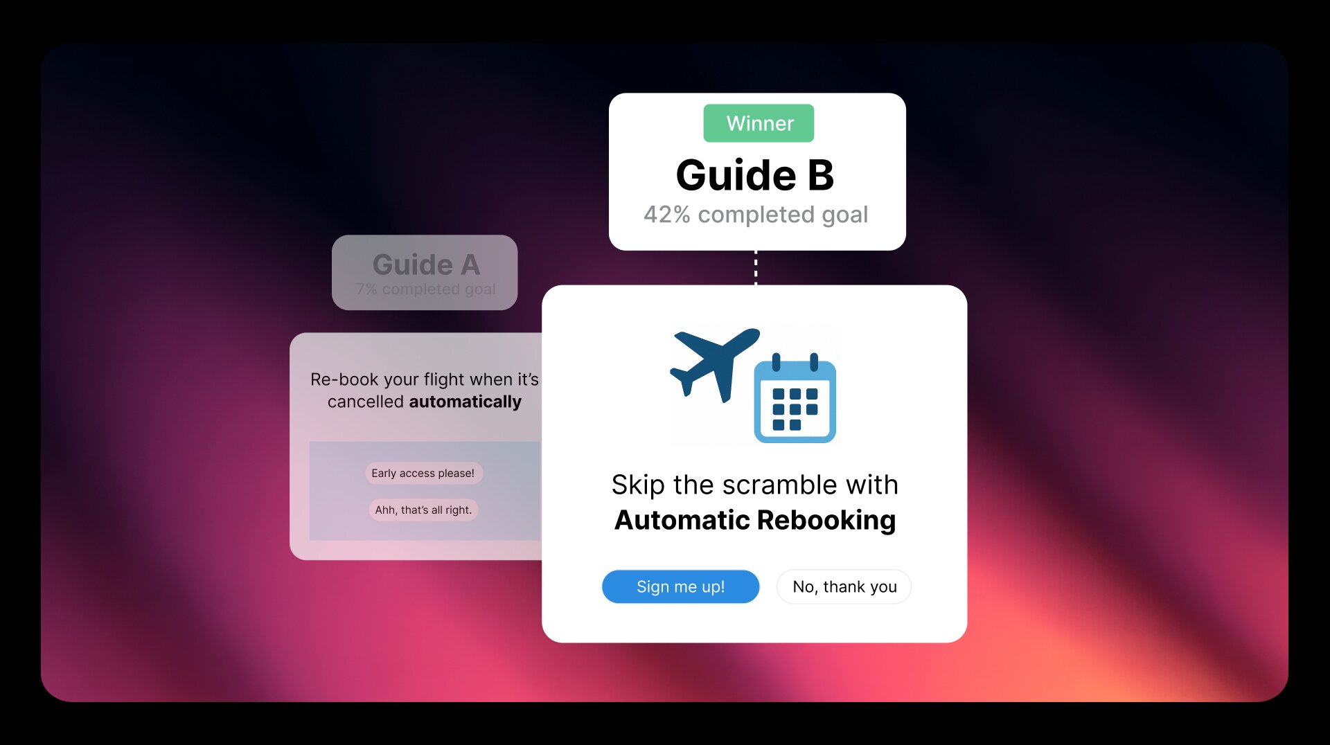
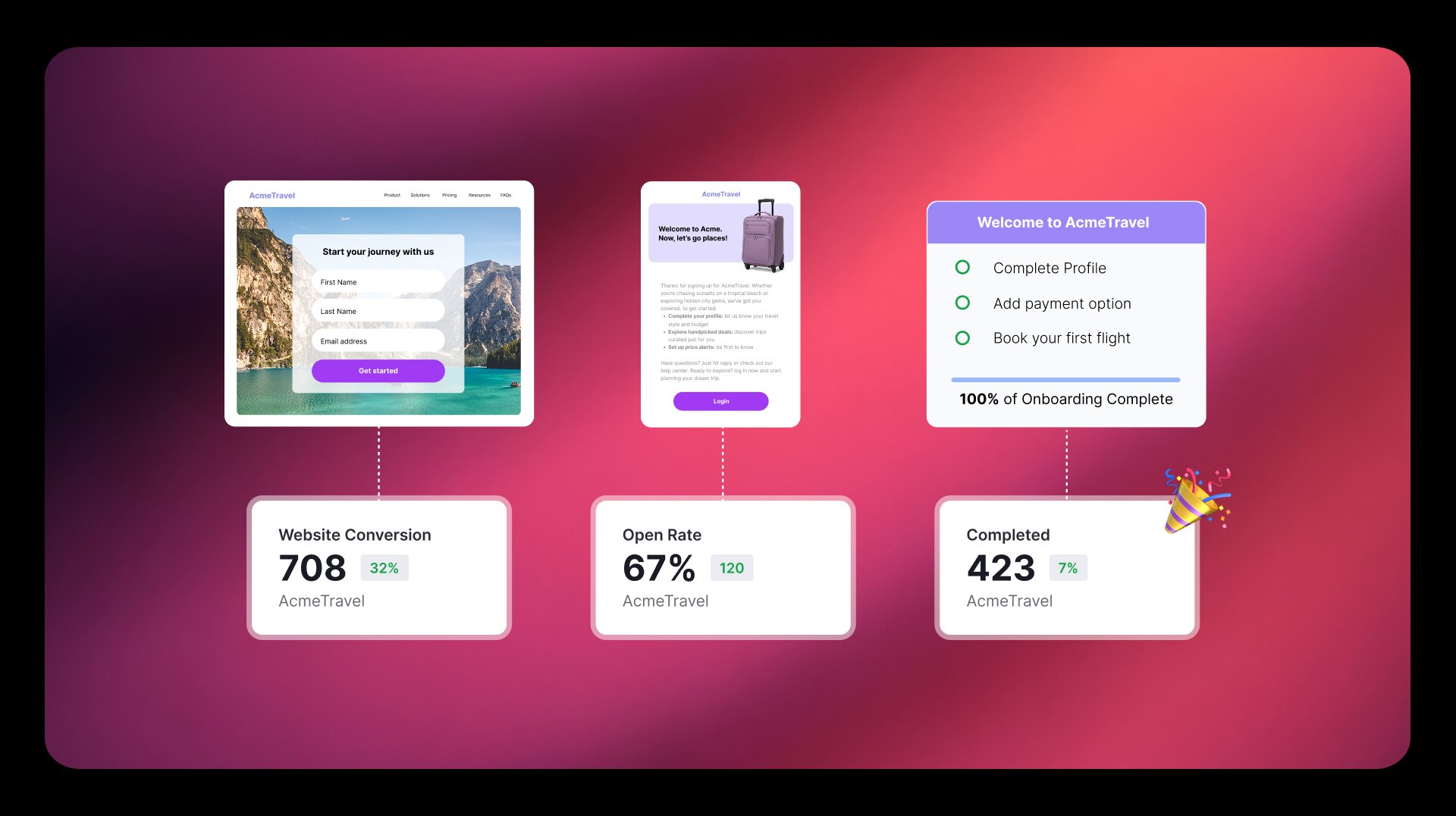
Guides are hardly a “set it and forget it” deal; in fact, the best thing about guides is that they’re the gift that keeps on giving, and thus should be built iteratively. Each of your in-app guides offers a goldmine of insights about your users. So, once you’ve launched a guide, always remember to go back and measure the results. If you created a multi-step walkthrough, are users making it all the way to the end? If a guide is meant to introduce users to a new feature, what does usage of that feature look like? This data will help you understand the impact of your in-app guides–and how you can adjust them to drive even better results.

Your guides aren’t just a way to communicate information to your users, they’re also an opportunity to hear from users and collect feedback. In-app surveys and polls are a friction-proof approach to gathering qualitative data. These guides can be useful for validating new features, understanding common pain points, and even spotlighting areas for improvement in the guides themselves. Most importantly, be sure to leverage both quantitative and qualitative data to tweak (and improve) your guides over time.

The best in-app guides balance meeting users where they are, and getting users to where they need to be. Using your product as a mechanism for communicating with customers is not only efficient, but helps ensure they get the most of your product. And since communication gets better with time and practice, it all starts with creating guides with their overall lifecycle in mind.