Data-driven feature development is critical to building great products, and it’s also a key characteristic of product-led organizations. What this means is that data–both qualitative or quantitative–is used to inform decisions throughout every step of the product development process.
For reference, an iterative product development process that delights customers typically looks like this:
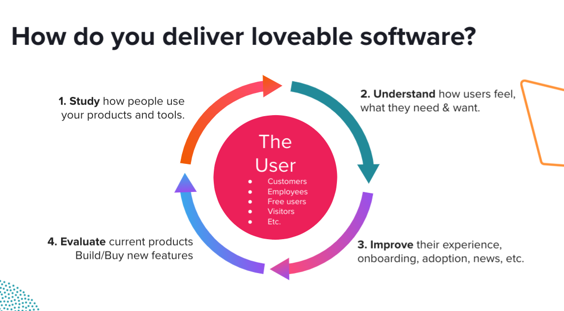
But as any good product manager knows, these individual phases are not so much linear as they are circular; there is a constant process of validation and feedback gathering before any big release. This is why concepts like minimum viable products, proof-of-concept, and beta periods exist: they allow real users to validate products, and PMs to pivot based on their feedback.
Most product teams rely on direct customer feedback and gut feel during this process, and struggle to take a more data-driven approach because it’s time-consuming and resource-intensive. That’s where Pendo can help.
Unsurprisingly, here at Pendo, our product managers are heavy Pendo users, too. Pendo is integral to our own product development process and helps us ensure we are building the right things for the right audience. So, how exactly do we use it?
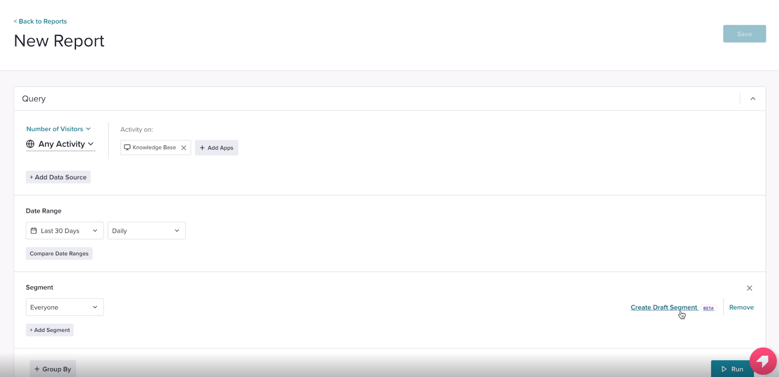
Let’s take a feature we recently made generally available as an example: Draft Segments. This is a feature in Data Explorer that enables users to build a temporary segment without having to save it. When the segment is created, it automatically saves with the report and can be accessed later.
Here’s how we leveraged Pendo to take a data-driven approach to developing Draft Segments:
Study and Understand: How do people use our products?
The goal of this feature was to reduce the number of segments created in any one subscription. Customers in Pendo Feedback indicated that many of the segments they create are one-time segments used to explore data and not meant to be reused in any meaningful capacity. Here is an example of a piece of feedback we received:
|
We knew that enabling users to create a temporary segment would ensure they only saved segments that would be used meaningfully for other assets in the future. In turn, this would significantly help reduce segment clutter in any subscription.
Here’s what this new feature looked like:
Improve: Optimizing the customer experience
At the end of January, we pushed the Draft Segments feature into open beta. We also launched a feedback poll with the beta release to collect open feedback from users as they used the functionality for their queries.
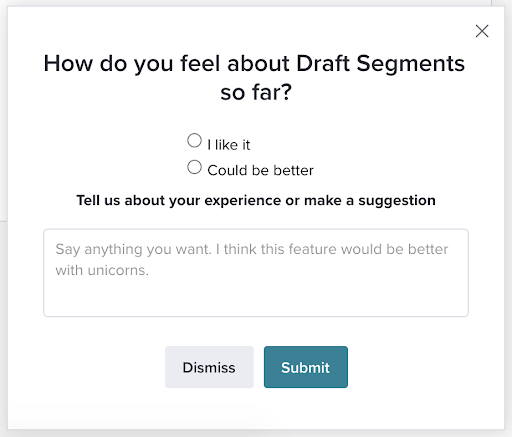
Generally, reception to Draft Segments was positive, though we did receive a handful of open-ended responses pointing out that there were a lot (read: too many) steps associated with adding a Draft Segment, along with other minor UX improvements.
We also closely tracked how many people used the new Draft Segments feature on Data Explorer, and whether it actually helped to curb new segment creation on the page–besides, that was the entire goal of releasing this feature in the first place.
Evaluate: Measuring the feature’s success
We set up a Data Explorer report to continuously track activity on the Create Draft Segment button vs. Create New Segment. While we initially saw a lot of click activity on the Draft Segments feature, we didn’t see overall new segment creation decrease significantly. We had a hypothesis: perhaps users were not entirely clear on what the feature was intended to do. So, we published a tooltip guide that clearly explained what the feature was and why users should use it to explore their data.
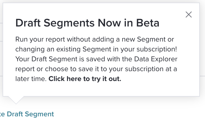
After publishing the tooltip, we started seeing a much more significant decrease in new segment creation, leading to an almost 50% reduction in new segment creation post-release.
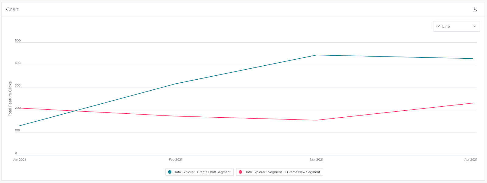
With these results, it was clear that the feature was meeting the goal we set. It was now time to make a few improvements based on beta feedback and push toward GA. Here’s what we did:
-
- Reduced the number of steps to add a draft segment by auto-opening the Segments section
- Simplified the Draft Segments creation flow
- Moved the +Create Draft Segments button closer to the Segment dropdown to encourage usage of the temporary segment instead of creating a new one
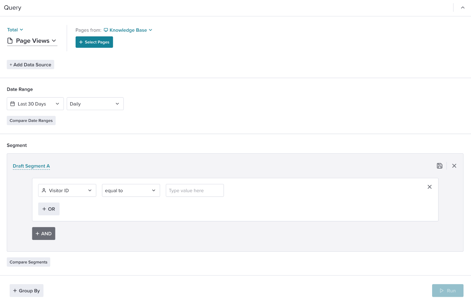
But we didn’t stop there. While combing through beta feedback, we received this response:
|
This feedback prompted another analysis; clearly, we had some customers who liked to filter results by account. The Account filter that exists is a great alternative to creating a new segment for every new account. Given that, we asked ourselves: where else is there a high volume of net-new segment creation where the Account filter does not exist?
We ran another Data Explorer report to identify where in the product segments were being created the most. The results were very telling: Data Explorer was only the second most common place where new segments were created–almost twice as many segments were being created on the Visitors page.
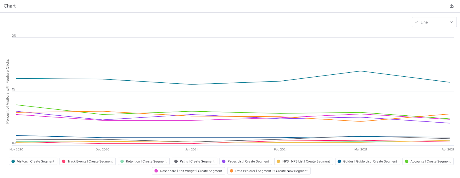
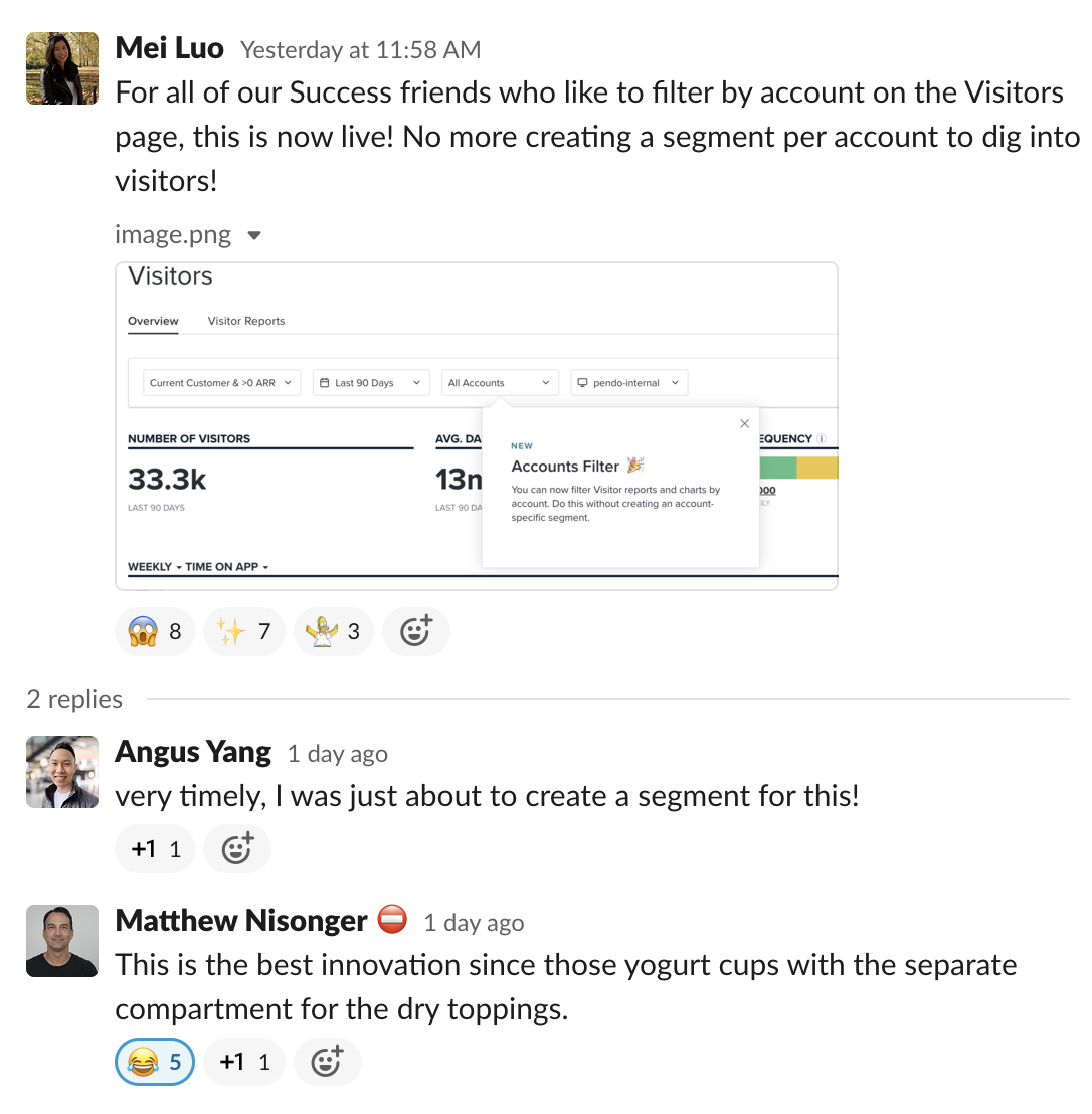
This made sense. Even internally we used the Visitors page heavily to filter for visitors belonging to specific accounts. In lieu of the Accounts Filter on that page, we were also creating one-off segments that targeted specific accounts.
As a result, we made the decision to also implement the Accounts filter to provide parity across the product and substantially reduce new segment creation.
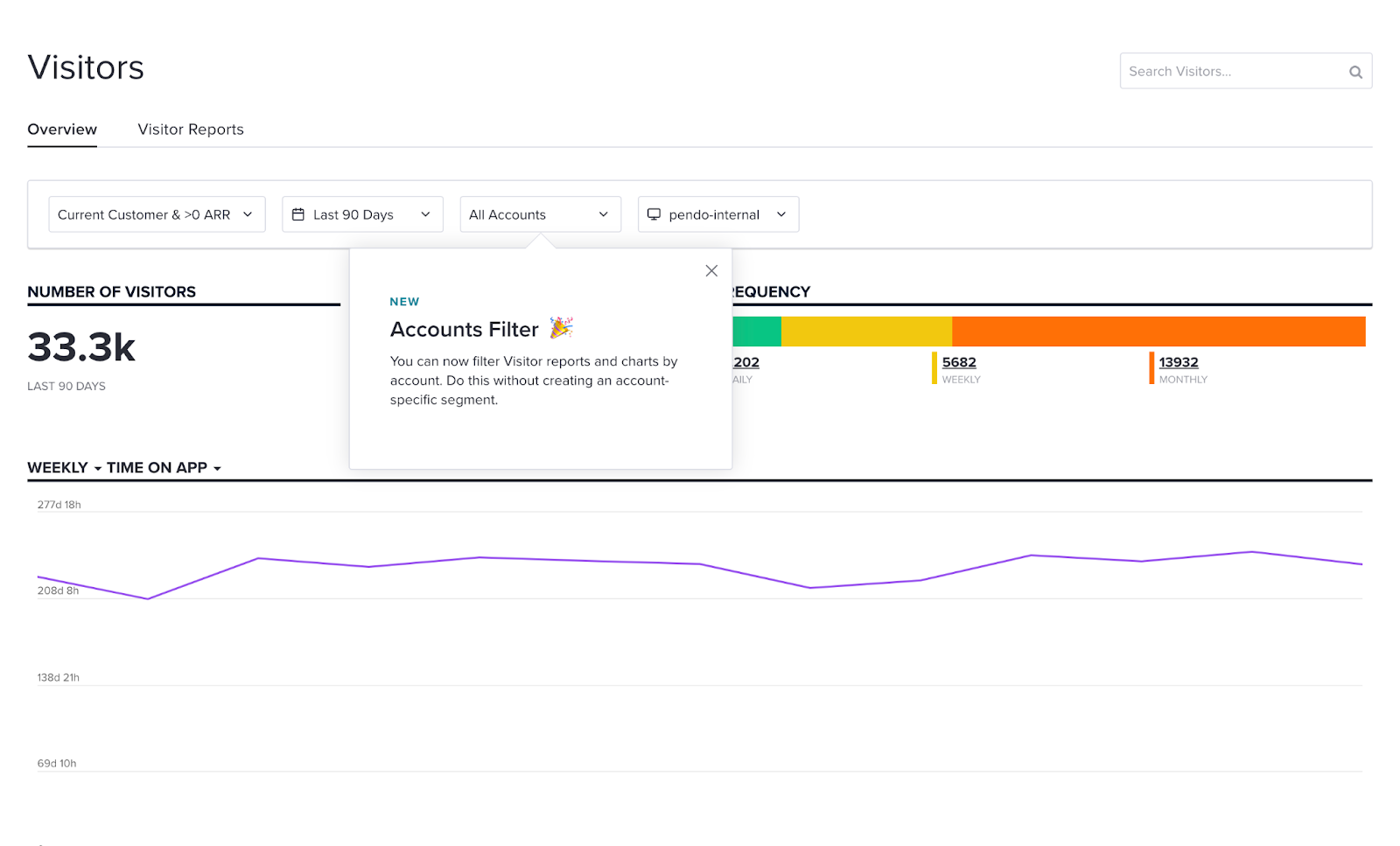
While it’s still too early to gauge the impact on overall segment creation, it’s certainly made some of our own Pendozers very happy!
PMs should never count out their intuition, but the feature development process is most successful when data is used to inform decisions. At Pendo, our product team relies on product data to help ensure we’re iterating features to maximize customer satisfaction–and I hope this post has given you some inspiration to do the same.


