Introducing Guide Categories: Harness the power of an intentional guide strategy
In-app guides are an essential tool for communicating with users directly inside your product. They’re valuable for a variety of teams across an organization: from product, to customer success, to marketing—even research teams love them. And they’re not just powerful, they’re effective: Pendo customer Healthicity saw 12x more engagement with in-app guides compared to email.
Although guides are a powerful tool, using guides at scale can run the risk of causing more problems than solutions.
Focusing on the full guide experience
Even the most beautifully designed guides can fail if the overall guide experience is bad. As large organizations leverage the power of in-app guides, administrators get stuck spending more time managing guides than they do launching them. And when multiple teams across the business are utilizing in-app communication, product managers, for example, don’t know about the guides their peers in marketing are shipping.
This lack of visibility leads to one of two outcomes: Either end users are bombarded with too many in-app messages, or one team holds the power of guides close to their chest and doesn’t let other teams tap into this powerful channel. Without the tools to wrangle a complete guide portfolio, you’re stuck in maintenance mode.
But it’s not your fault.
The best in-app guide platforms give creators the power to build a beautiful guide, while also giving them the tools to understand how it fits into their larger in-app communication strategy.
Introducing Guide Categories: New tools to orchestrate your guide experience
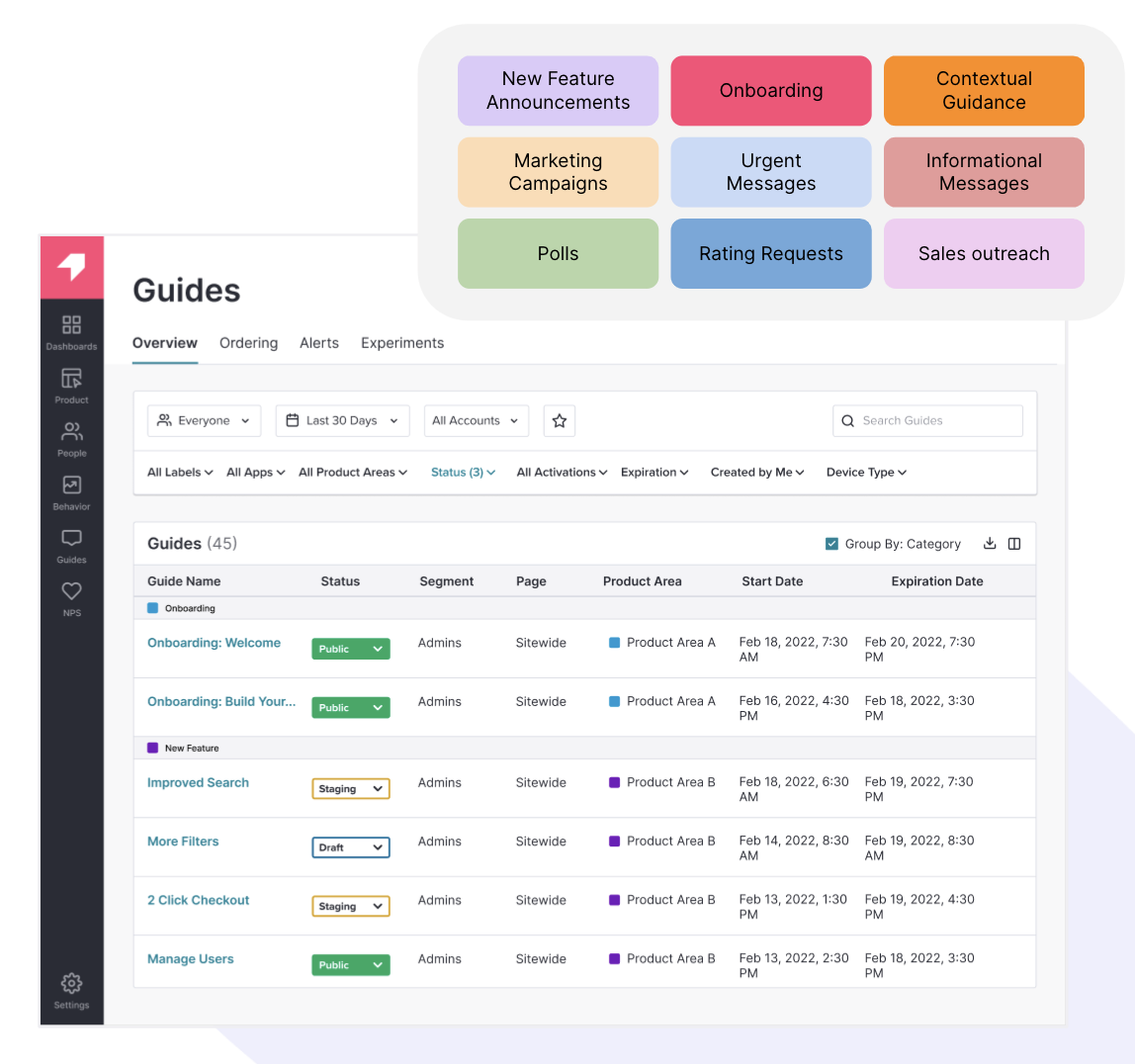
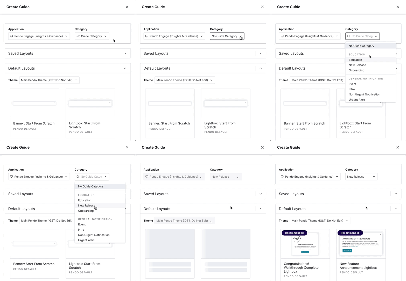
Pendo wants to reduce the guessing game of guides, and give creators an easy way to organize all the in-app guides in their portfolio. Creators can now set a Guide Category in the guide building workflow based on the goal of that message. Are you announcing a new feature? Is your guide part of an onboarding workflow? Is it an urgent message, or part of an evergreen marketing campaign?
By categorizing your guides, creators and administrators have the visibility to understand, organize, and make improvements to their guide portfolio, all from a refreshed Guides Overview page.

With these new categories, guide creators can filter (and soon, group by) the active guides in their portfolio to answer questions like:
-
- What do my users see when they land on this page?
- What is the onboarding experience for this product area?
- Which team within my organization is leveraging guides?
Guide Categories give teams the visibility to understand the goal for each guide in their portfolio, allowing them to make more educated decisions about which guides take priority for the end user. This also gives other teams the ability to jump in and start building effective guides, because Pendo will automatically recommend guide layouts based on the category a guide builder selects.

Once a guide is published, guide administrators can use the Guide Ordering page to prioritize which guides the end user sees first. For example, a guide admin might see that an urgent message fell behind a marketing announcement, then easily drag and drop to move that urgent alert to the top of the stack.
By categorizing guides, even the most complex in-app guide portfolios can remain organized as they grow. Admins have the control to understand, organize, and prioritize their entire guide portfolio, which in turn creates a better end user experience. No more bombarding users with in-app messages or restricting guide building access to a few team members—with tools to orchestrate your guide strategy, organizations can be confident they’re sending the right message at the right time, every time.
For more best practices on creating an intentional in-app communication strategy, check out our e-book, “How enterprise companies manage in-app communication at scale.” If you want to learn more about Guide Categories in Pendo, check out this overview.


