The best products are built by truly imagining the user experience. Your goal as a product person is to deeply understand the user and then share this understanding with the team.
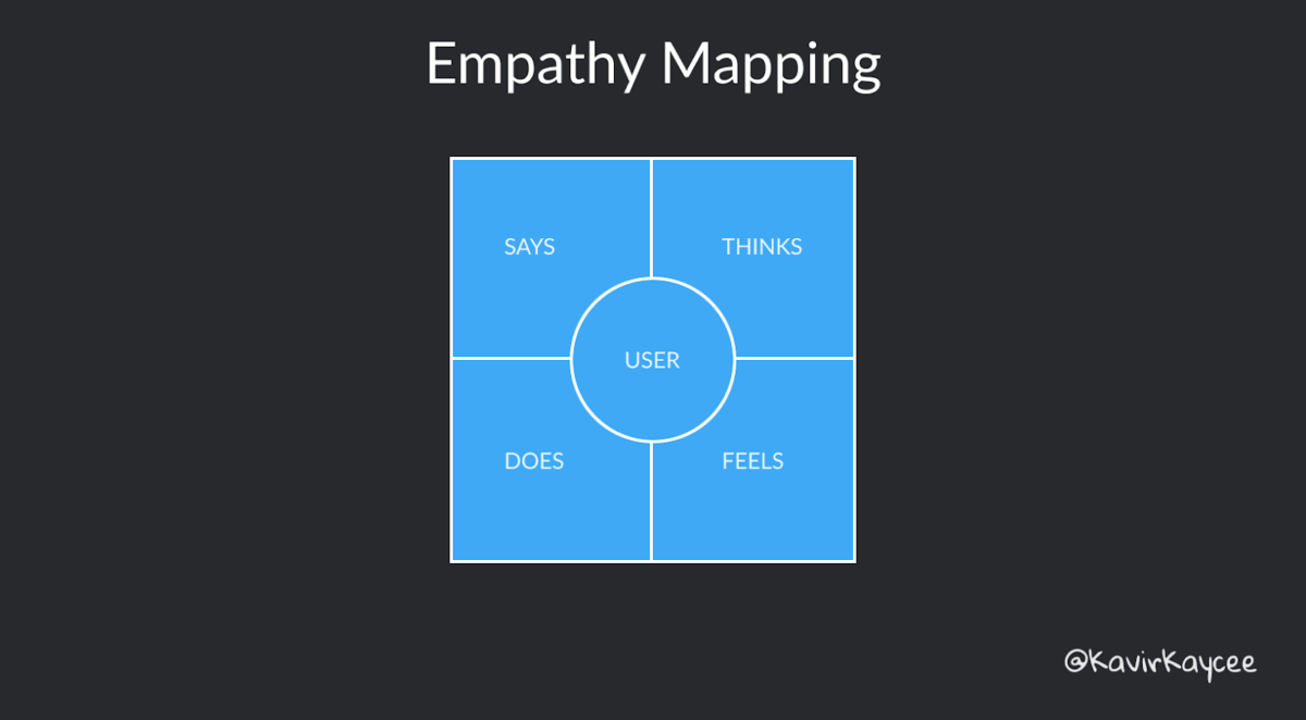
Empathy mapping is a framework that enables exactly this. In this framework, you put yourself in the shoes of the user by capturing what they Think, Say, Feel, and Do.

Remember, the goal of this exercise is to learn as much as you can from the user. It’s about understanding their mental model. Don’t take this as an opportunity to correct their perceptions.
I’ll walk you through this framework with the help of an example.
Imagine the product was a collaborative writing tool for companies.
Thinks
This refers to what the user thinks while using the product. We don’t have a mechanism yet to read thoughts, so the only way to figure this is for the user to think aloud during the research. You can identify the user’s jobs-to-be-done this way.
Using our example: users may say: “I am looking for the button to create a new document,” “I am thinking about how to share the document”, and so on.
Says
What does the user say to the interviewer directly? There will be an overlap between thinking aloud and saying. The key difference is thinking aloud is more like talking to self, whereas saying is expressing it to someone else.
Usually, if they have to say something, they would say it directly. But you can always probe users to be more prompt about anything.
In our example: “I expected the create new doc button to be on the top right”or “I like that there was a Cmd + K keyboard shortcut when I hover over the search bar”.
Feels
What is the emotion being felt by the user? As a user, I could feel impatient, frustrated content, or confused.
Unless the product is very glitchy, the emotions would not tend to be extreme.
While user testing, ask the users to express their feelings at each step. This might not be easy as people might not be able to accurately express the emotions they are feeling.But if you’re able to get this emotional feedback, you can design a better product.
This emotional feedback may sound something like – “I feel pleased with this UI element.” “I feel confused about what to do next.”
Don’t disagree with the emotion being felt. Don’t say, “You are not supposed to feel this way”. Rather, dig deeper for the reason.
In our example: “I felt happy that I could change the icon of a document to an emoji.”
Does
What actions does the user take? You can observe this directly in-person, through screen sharing, or through product metrics.
For instance, they move the mouse to an area of the screen, click at a point, click at another point and then realize that it is not the correct action and go back.
You can identify issues like UI discoverability, friction while using, usage, and so on.
In our example: the user expanded and collapsed the list of documents in categories to find the document they were trying to search.
When to use this framework?
You can use empathy mapping at any stage of the product life cycle, but it’s better to do it at the beginning of the UX journey. Because the insights gained from this exercise can be fed back into the product to improve it.
It’s also useful for digital experiences (app onboarding, buying user flow, new feature), or even physical experiences (museum tour, or employee onboarding).
Analyze the results
Account for dissonance
Ideally, the inputs from what the user says, thinks, feels, and does — should be in sync. But occasionally, there can be dissonance between the 4 states. And that’s okay.
For example, if the user says “ I really love the product” but doesn’t end up using it, then there’s a dissonance.
Aggregate at Persona level
Organize users into personas and try to aggregate the results at a persona level. Don’t take only one user’s inputs and immediately start acting on the feedback.
Aggregating helps account for any outliers in the data.
Outcome
Empathy mapping is an exercise that you can do in conjunction with user testing at any stage of building the product. By doing this, you consistently paint an accurate picture of the user in your head and use this deeper understanding to build a better product.


