Table of Contents
In a rush?
Download the PDF for later
Introduction
Why you need to consider the full in-app experience
We’ve all been there as software users: trying to navigate a new platform or get something done in a tool we use every day, only to be bombarded with what feels like endless pop-up messages. Frustrating at best, these moments can have lasting negative effects. And while no company sets out to disrupt users’ workflows or get in the way of productivity, they can sometimes end up doing so due to a lack of coordination.
Product-led companies recognize that leveraging the product to communicate with users is a powerful tactic for all teams. However, these benefits quickly dwindle if companies aren’t considering the end user’s full experience. At large enterprises where multiple people or entire teams are creating in-app messages (often referred to as in-app guides or guides) with different goals, it’s especially true that more isn’t necessarily better. If you’re not thinking about all of the in-app communications a single user could see at any given time, you run the risk of spamming them—and deterring them from using your software at all.
Think about an orchestra: Even if every individual musician is phenomenal, that doesn’t guarantee a beautiful performance. True harmony only happens if everyone plays from the same sheet music, with a conductor overseeing everything together. Like an orchestra, companies need a way to manage the user experience inside their product—first by building beautiful in-app guides, then by considering how those guides fit into the experience as a whole.
Throughout the rest of this e-book, you’ll learn what goes into a successful in-app communication strategy and how to implement these best practices at your own organization.
How different teams leverage in-app communication
Once your organization realizes the power of in-app communication, you could be managing any number of people and teams using the product to communicate with users and customers. Since different teams (and individuals) care about different types of guides—each with its own distinct goals—it’s important to understand all of the reasons a user might see an in-app guide throughout their workflow.
Here are some key in-app communication use cases for four teams across an organization:
Product management
Marketing
Customer success / support
Sales
These are just some of the ways that teams across your organization might be communicating with users in-app. Now put yourself in your users’ shoes: Would you want to see a guide tied to five of these use cases every time you logged into a software product? Probably not.
With so many people involved in creating guides, you need a way to properly manage, strategize, and measure the full user experience with them. Without proactive guide management, you run the risk of leaving users frustrated or discouraged from coming back to the product at all. Throughout the next sections, we dig into ways you can ensure a cohesive, deliberate in-app experience for your users.
Best practice #1
Establish processes
The first order of business is to build a process around your in-app communication efforts. While this will look different for every enterprise (since business goals, team structures, and products differ from company to company), the best place to start is to think about everything that needs to happen in order to get an in-app guide created.
It’s important to create clear processes for:
How to submit in-app guide requests
Create an easy way for teammates across the organization to request a new in-app guide or campaign. This is your first line of defense against creating too many in-app guides or guides that aren’t up to your set standards. No matter what type of tool you use to collect these requests, be sure to include fields for all of the key information you need. Which product is this for? Who is the target audience? How long should it run? Where in the application should it live? Answers to these types of questions will ensure you have everything you need to take a guide from idea to implementation.
How (and how often) guide requests are reviewed
Think through the types of checks you’ll want to have in place—things like copy, design, segmentation, guide location and activation, and time limit. Build these checks into your processes, and consider assigning an owner for each component. In general, it’s important to always ask yourself why you’re publishing a particular guide, especially if it’s intended to reach a large portion of your user base.
How in-app guides are built and implemented
Although anyone at your organization should be able to submit a guide request, consider restricting who can actually publish guides in your product. This way, there’s clear oversight and alignment around every in-app guide that’s running. Your in-app communication tool should also allow you to schedule guides ahead of time and set an end time for each guide, so you don’t have to go back and manually switch them off.
In addition to establishing processes for those three workflows, here are some other tactics to include in your overall strategy:
Build a cross-functional team
With any process comes the need for ownership. In the case of in-app communication, this is a company-wide effort that requires an equally cross-functional team to support and manage it. The makeup of this team will depend on how your company is structured, but we recommend having representatives from a combination of these functions:
Once you’ve identified your team, you can start assigning owners for each step of your processes. For example, product marketing might have final sign-off on all guide copy, while product operations might own segmentation and targeting.
Set a prioritization framework
Since you and your team will receive requests for many different types of guides, you will need a framework that helps you prioritize guides based on their purpose or goal. This will make it easier to choose which guides to publish when—and helps set some boundaries with the rest of your organization.
Start by identifying and categorizing your core in-app communication use cases. Then, determine which categories should take precedence over others. For example, is a guide highlighting a new feature more important than a guide highlighting an upcoming marketing webinar? Should product bug announcements supersede any other type of guide? These questions will likely spark some healthy debate, but it’s important to establish this hierarchy from the beginning.
Publish governance documentation
Once you’ve built out processes and put together a core team, it’s important to document all of your in-app communication governance practices. This should include everything from how to create an in-app guide, to how guides are prioritized, to who on the team owns what. As your company grows or people come and go, it’s good practice to have all of this information documented in one place.
Track guide performance data
If your tool provides any in-app guide metrics, it’s crucial to check in on guide performance—both to ensure users are engaging with and seeing value from them, and also to inform future guides. This might be something you build into your guide creation process, and assign an owner to continuously track the performance of your in-app guides and report back to the broader team.
Best practice #2
Always consider your users’ workflows
Take a step back and think about a user’s experience inside your product, and how your in-app communication best fits in. Remember: These messages should always improve and enhance a user’s experience, not detract from it.
This means thinking about how you’re injecting messages into users’ workflows. If it’s a guide announcing a feature launch, you might want users to only see the message one time. If the guide is meant to help them navigate a complex task, you might want users to be able to come back to the message, for example by anchoring it to a badge that’s activated on mouse hover.
The activation type you choose will also depend on a guide’s particular purpose. While you usually won’t want to interrupt users’ workflows, sometimes you might need to—and there are activation methods for both scenarios. Here’s a quick overview of four main ways that a guide can appear to a user:
Put the right limitations in place
You should also set limits based on how your users interact with the product. If there’s an area of your application that requires deep focus, it might be best to avoid placing any guides in that location. Similarly, if your product has a common workflow that takes users a long time to complete, that’s probably not the best point to interrupt them with multiple in-app messages. Your in-app communication tool should allow you to set these limits at the admin level so that these restrictions come built in for every new guide that’s created.
Finally, set a time limit or expiration date for your in-app guides. You can always extend the timeline if a guide is particularly effective or needs to stay up longer to deliver on its purpose, but this will help avoid guides staying active past when they should and cluttering your UI.
Best practice #3
Choose the right in-app guide format
Viewing your in-app communications as a holistic experience also involves choosing the right in-app guide format for the right situation. As more teams look to the product as a communication channel, it’s helpful to establish best practices around when to use a certain type of guide. Here’s a quick overview of five types of in-app communications:
A banner is an in-app guide that is aligned to the edge of the browser window or phone screen, while the rest of the screen usually remains clickable.

These appear only when users navigate to a specific area (or icon) or perform a certain action in the product. They’re useful for providing in-context support, since users can read the information and see the feature the tooltip is referring to at the same time.

Also referred to as a “pop-up” or “modal,” lightboxes often dim or darken the rest of the page in order to emphasize the guide’s content—some lightboxes even prevent users from interacting with the rest of the page until they dismiss the message.

An interstitial guide displays between two screens or pages in a user’s workflow, and is commonly used for maintenance announcements or important feature updates.
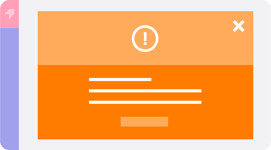
A walkthrough is a multi-step flow that can comprise multiple guide types. As the name suggests, these are meant to walk users through a certain action or workflow.

In general, your primary goal should be to minimize disruption to users’ workflows as much as possible while still providing the right information. For example, if you have a company announcement you want users to be aware of but don’t want it to prevent them from working in your app, a banner is probably best. Since lightboxes can be intrusive to the user experience, they’re better suited for important notifications that require users’ immediate attention. Another option is to house in-app guides in a designated help or resource center in your product. That way, users can access product announcements, in-app tutorials, and training materials when they need them.
Best practice #4
Segment appropriately
One of the best ways to ensure in-app guides are effective is to make sure they are relevant to their intended audience. Segmentation allows you to target in-app guides to specific subsets of your user base—adding an important layer of personalization to their product experience.
The more specific your segmentation, the more guides you can create without overwhelming users. Segmentation also helps you avoid mistakes like displaying guides that aren’t relevant to their role or admin level.
Your tool should allow you to segment communications based on user metadata and user behavior in your product. Here are some segmentation examples to inspire your in-app guide strategy:
The importance of understanding your personas
You likely have multiple types of users who find value in your application. They have differing job titles, goals, and key workflows—but your product needs to support them all.
Spend time understanding your different personas and use quantitative and qualitative data to determine what each group needs from the product. If you’re capturing job titles in your user data, see how in-app behaviors vary depending on a user’s role. Similarly, turn to your feedback data to see what users are saying about what they want from their experience. You might have one type of user who benefits from in-app communication with in-depth information, whereas other users access the product to get a single task done quickly. You can use these insights to deliver a most personalized in-app experience and cater to different types of users’ needs.
Best practice #5
Create a consistent, on-brand experience
When communicating with users in-app, these messages should blend beautifully with the rest of your product. This means thinking about how to align in-app guides with brand guidelines and ensuring consistency across all of the guides inside your product or portfolio of products.
In the end, the look and feel of your in-app communication plays a large role in how effective they are. If users see a guide that feels out of place within the application, they might get confused—or ignore it entirely.
The best way to solve for this is to choose a tool that allows you to set parameters to ensure you’re creating touchpoints that look and feel cohesive and empower guide creators with standards out of the box. For example, to ensure guides look like they’re all coming from the same place, you should set themes and layouts at an organization level. This way, anyone who creates a guide can automatically leverage existing templates and build it within the design system you’ve already set. It’s a win-win: The rest of your organization can spin up guides quickly, and you can rest easy knowing every guide in your application is consistent and on-brand.
- Establish themes (e.g. with set color palettes and fonts) to ensure consistency in the formatting and style of your in-app communications
- Create a library of pre-approved guide templates that the rest of your organization can choose from
- If you have multiple products in your portfolio, utilize the same guide themes and templates across all of them
- Document any additional guidelines that guide creators should know about, for example image and video best practices or a voice and style writing guide
The company-wide benefits of establishing governance
The positive impact of a well-executed in-app communication strategy extends throughout an entire enterprise organization. By putting in the work upfront to create an in-app experience that’s rooted in consistency and guided by the right processes, organizations can see major benefits:
Developing a cross-functional communication strategy (and processes to help enforce it) will only improve the lives of both your customers and internal stakeholders. By focusing on the entire in-app experience, companies can ensure they’re delivering the right messages, to the right users, at the right time—think of it as the gold standard for any product-led enterprise.