Table of Contents
- Which features have the biggest impact on customer sentiment and retention?
- Step 1: Your most popular features
- Step 2: Variations by user group
- Step 3: Impact on retention
- What order do users like to access these features?
- Step 1: Understand drop-off
- Step 2: Find alternate paths
- Let data lead the way
In a rush?
Download the PDF for later
As you get started with in-app onboarding, your initial focus will be building a single walkthrough for all new users, highlighting key features and pages of your product. At the beginning, deciding which features to surface is likely based primarily on informed hypotheses. Some customers stop here and allow their onboarding flow to rely primarily on instinct, a common onboarding pitfall.
Creating optimized in-app onboarding requires periods of iteration and experimentation. To do this effectively, you will need product data to understand which features are most likely to lead to positive customer outcomes. Adjusting your onboarding based on these findings will ensure your onboarding can impact your business’s most important KPIs.
CUSTOMER STORY

Citrix used Pendo to release an in-app onboarding experience to their free trial users. Their initial flow was based primarily on what they felt would be most important to highlight to free trial users. In reviewing product usage data, it was revealed that a different feature set was more likely to lead to trial conversion. After adjusting their onboarding walkthrough to reflect these learnings, they were able to increase their free trial conversion by 11%.
To start refining your onboarding flow using product data, ask yourself two questions:
1. Which features have the biggest impact on customer sentiment, retention, or conversion?
2. In what order do users like to access these features?
This step-by-step guide will walk you through how you can answer each of these questions using Pendo.
Which features have the biggest impact on customer sentiment and retention?
Step 1: Your most popular features
Know what your most popular features are
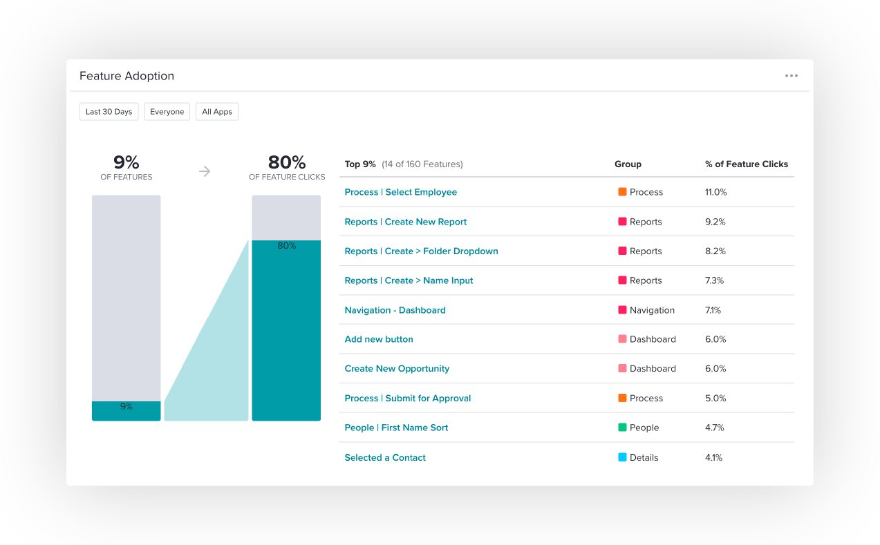
The first step towards optimizing your onboarding flow is actually knowing which features users are leveraging most and whether this aligns with what you hypothesized in your initial onboarding design. You can use the Feature Adoption Widget located in the dashboard section of the application to identify which features generate 80% of the click volume in your application.
PRO TIP
Keep onboarding as short as possible. Adjust the Feature Adoption Widget to show which features generate the vast majority of feature clicks to help isolate a narrower set of features.
Clicking on an individual feature will give you a better understanding of usage over time and usage by visitor and account.
Step 2: Variations by user group
Determine if these vary by customer sentiment
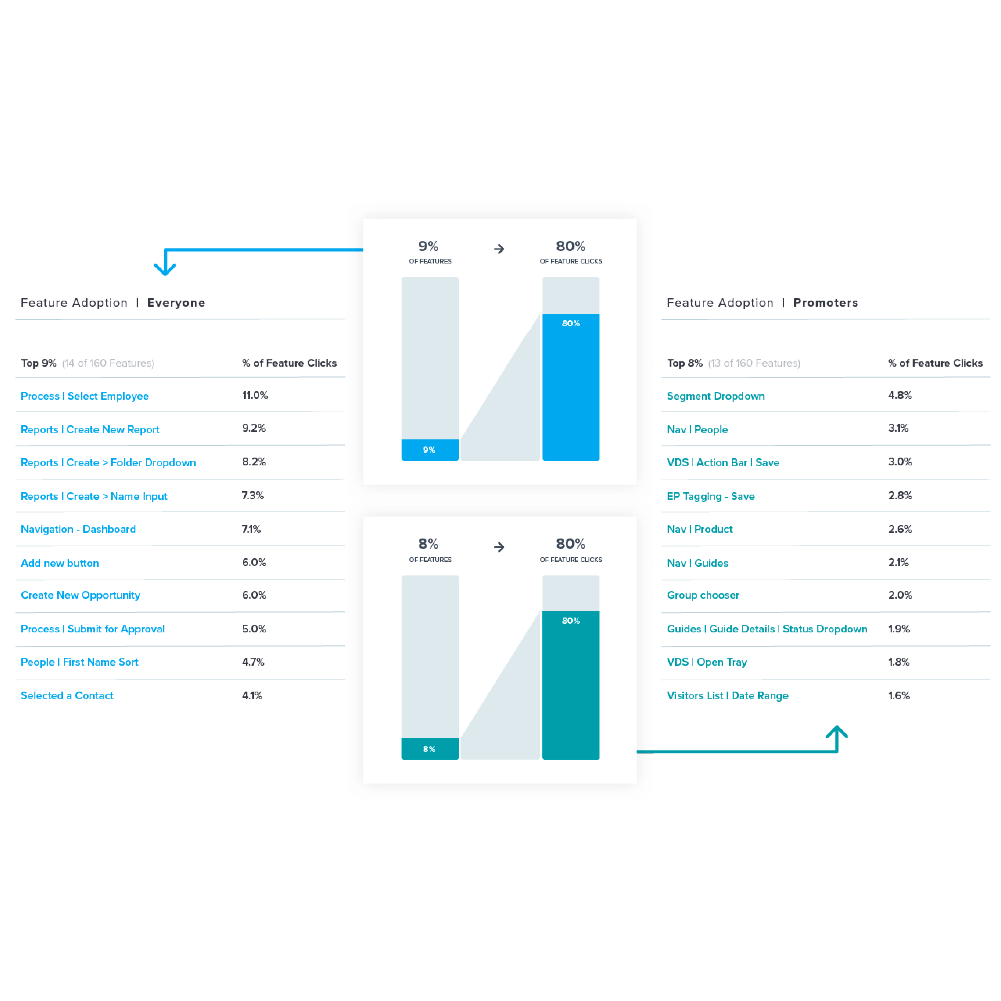
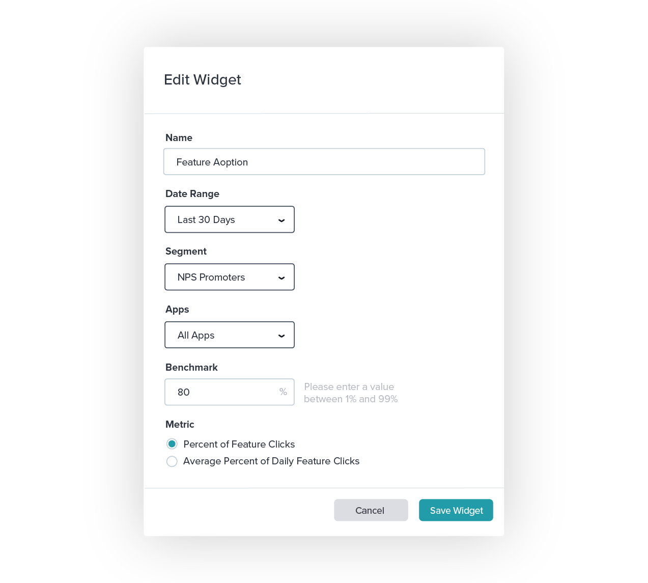
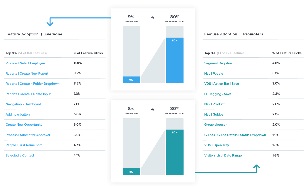
While looking at the most popular features is valuable to get a sense of where users spend most of their time, it is not always an indicator of how these features impact customer outcomes. In order to have a better sense of which features produce positive customer sentiment, you should add a segment to the feature adoption widget to see if feature usage varies based on NPS scores.
Comparing the usage by promoters to the list of the most popular features can help validate which features to highlight in your onboarding walkthroughs.
Step 3: Impact on retention
Understand the impact of the features you identified on retention
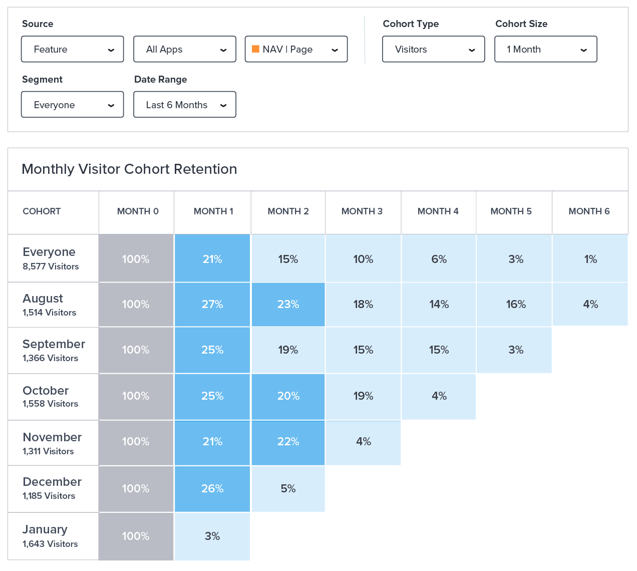
Ultimately, you want to lead customers to the features that correspond to high retention and value realization. Once you have a more informed hypothesis of which features to train users on using the Feature Adoption Widget, you can access the Retention page to validate that these features also have a positive impact on user retention.
Pendo’s Retention page provides a cohort analysis of the percentage of users that continue to return to your app over time. In addition to viewing high-level trends, you can view retention by a certain feature, page, or track event, to understand what impact the features you’re highlighting in onboarding have on return usage over time.
PRO TIP
You can leverage Pendo’s interactive benchmark tool to help set targets for overall app retention and understand how you’re performing in relation to your peers.
Looking at overall feature adoption, feature adoption by user sentiment, and retention by feature should give you a more holistic view of what drives positive customer outcomes. Update your onboarding to reflect these findings and ensure your training is more directly tied to customer loyalty.
What order do users like to access these features?
In order to help verify the correct order of your onboarding guides, use Pendo to assess where users are falling off in your current flow and better understand where they’re going instead.
Step 1: Understand drop-off
Understand where users are dropping off in your current onboarding flow
Pendo’s Funnel feature allows you to measure how customers move through a defined series of steps. They provide visibility into where your customers drop-off when following these steps.
If you have a three-step onboarding guide, for example, you can build a funnel mirroring the navigation steps you’re asking users to take within the guide.
PRO TIP
To have a more precise lens into onboarding effectiveness, you should apply a segment that filters for users who have engaged with the guide you’re trying to measure.
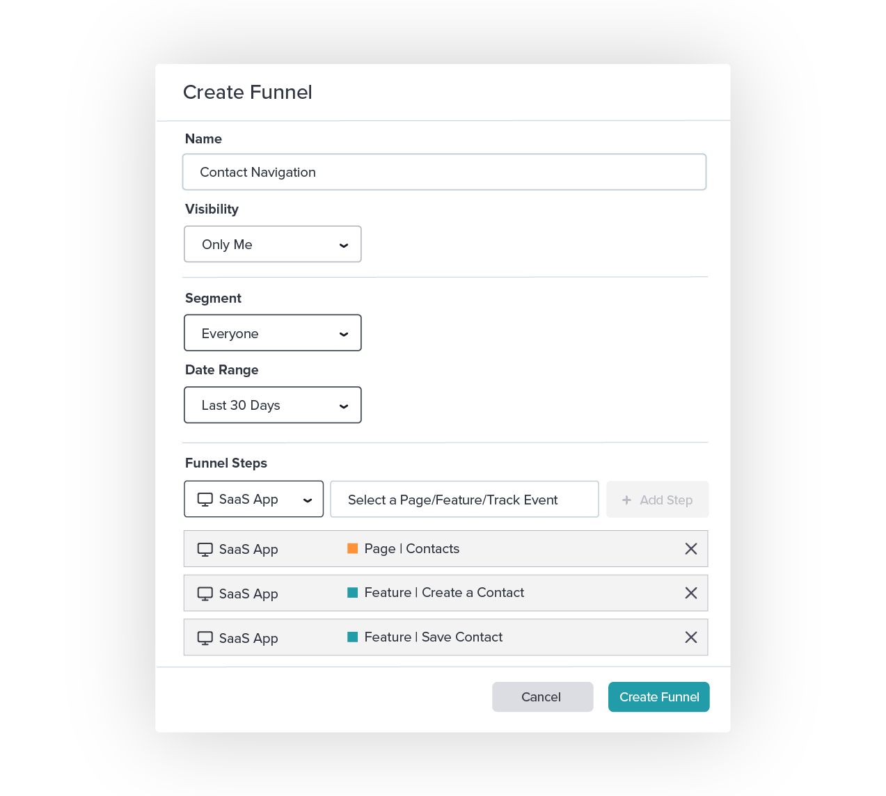
Once you generate the funnel, you can easily see where users are departing from completing the task outlined in the onboarding guides you’ve created.
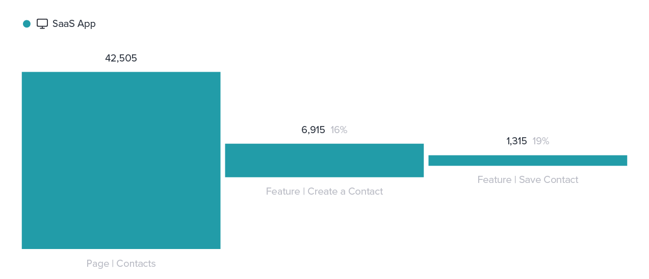
Seeing high completion rates will indicate that the guide’s order is successful in driving desired behavior. Identifying high drop-off rates at certain steps can help indicate where the guide may need to be adjusted in future iterations.
Step 2: Find alternate paths
Determine where they are going instead
In order to understand where users are going when they fall off the desired path, you can use Pendo’s path functionality. Paths outline the steps a user takes after reaching a certain starting point in your application.
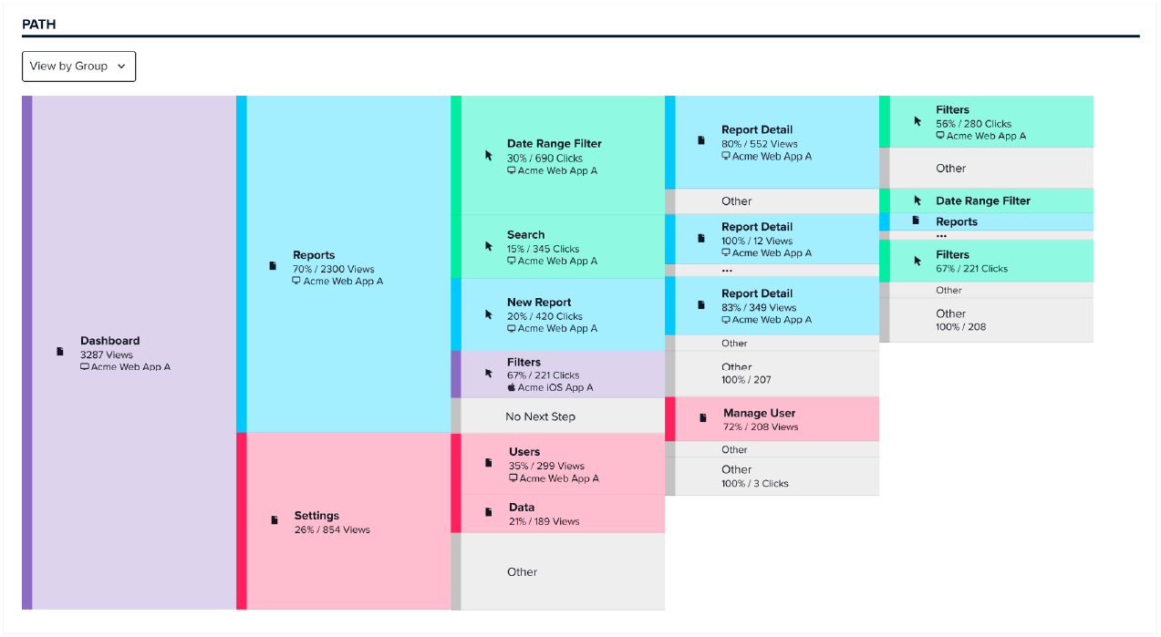
Analyzing a path from a certain feature highlighted in your onboarding flow allows you to visualize how many users are taking the desired steps indicated in your onboarding walkthrough. In addition, you can see where else in the app users are going if they’re not following the designated steps. Clicking into each step will provide additional detail and can help inform if the path you’re highlighting isn’t the path most users prefer.
Let data lead the way
In-app onboarding is critical to driving customer loyalty and retention. But if your strategy isn’t tied to the right customer outcomes, the onboarding experience won’t reach its full potential. With Pendo, you can combine in-app guidance with robust product analytics to not only create a more effective onboarding experience, but also connect it to the outcomes that are most beneficial to the business.
Read on to learn how to leverage product data to personalize your onboarding experience for different cohorts of users.